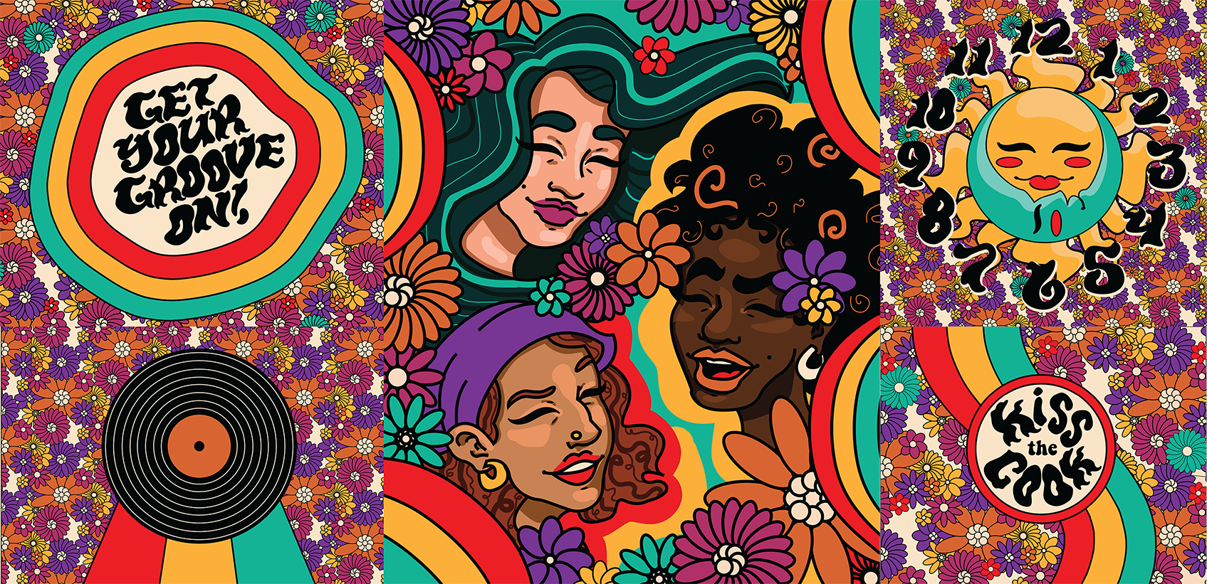
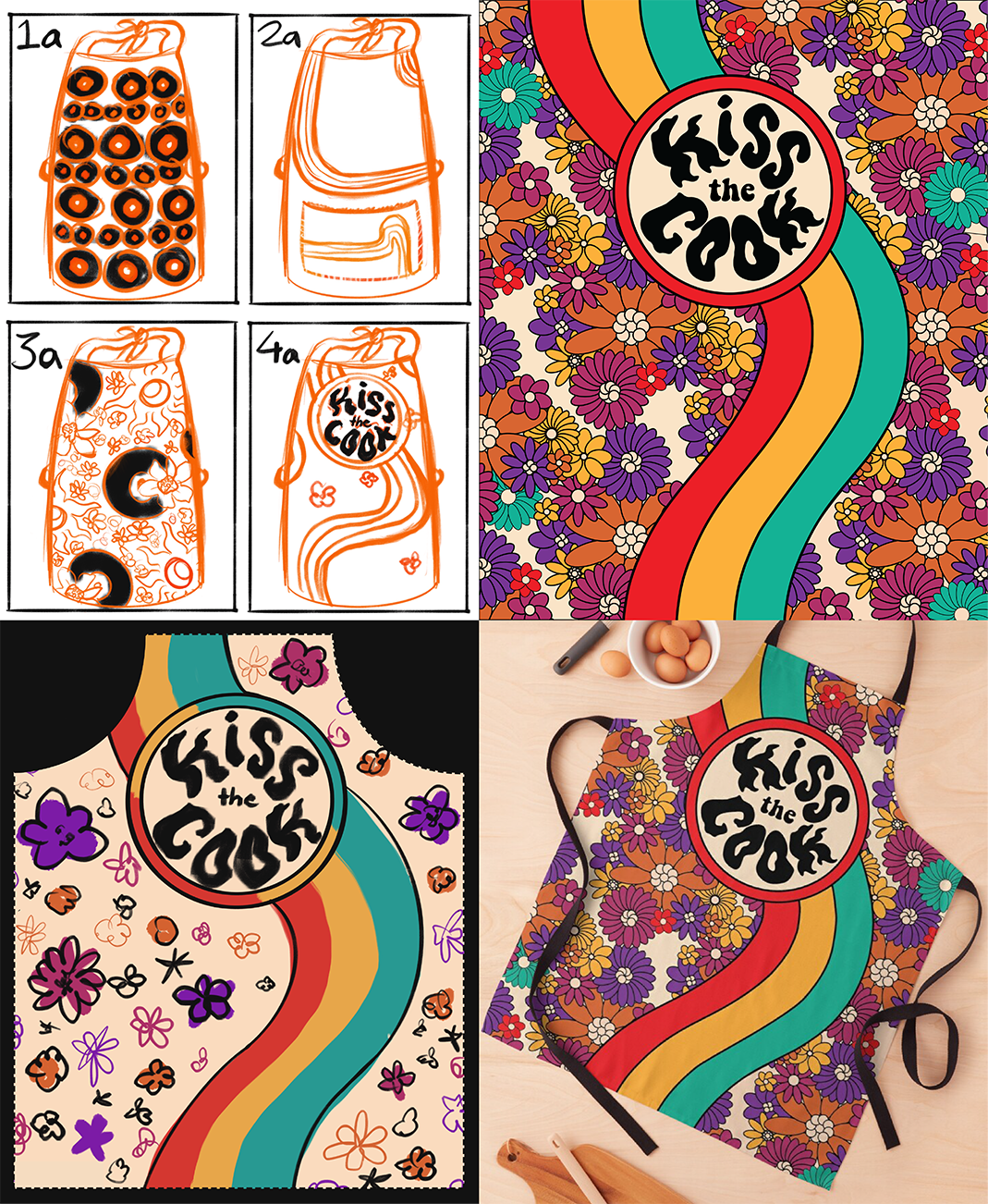
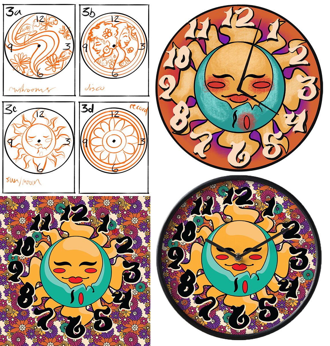
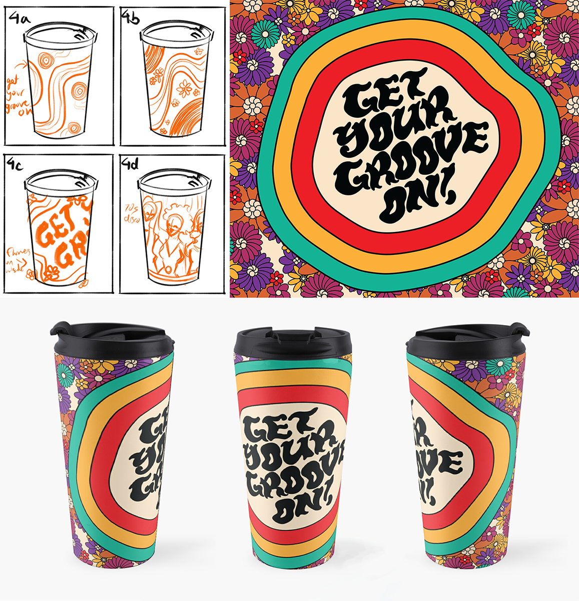
The objects I had to create illustrations for were a clock, apron, bed comforter, travel mug, and a backpack. After getting feedback from my creative peers on which of my ideas would be best to move forward with, I solidified my color palette for my illustrations and did colored sketches. I then got feedback on color choices and revised before creating my final artworks. Experimenting with placement and pattern on the products was a great experience since I was able to see how it could change the feeling of the final work, and influence who would be interested in purchasing it.
My favorite part of the process was by far creating the type for the apron and travel mug. I've lovingly dubbed the font as the “Get Stompin’!” typeface because of the high heel-like serifs on the bottom of many of the letterforms. Creating the comforter was also super fun because I was able to give a copy of each product to the models I used for the artwork, and their joy upon receiving the final product was so fulfilling.
Get Your Groove On!
Surface Design
Jan-Feb 2022